There is a before and after in how products become popular. Before, you needed a budget — a television slot, a magazine spread, a celebrity willing to hold your product and smile. After, you need a photograph. A good one. One that lands in the right feed at the right moment and makes someone think: I want that in my life.
Copper and steel bottles landed on the right side of that shift.
The Flat-Lay Changed Everything
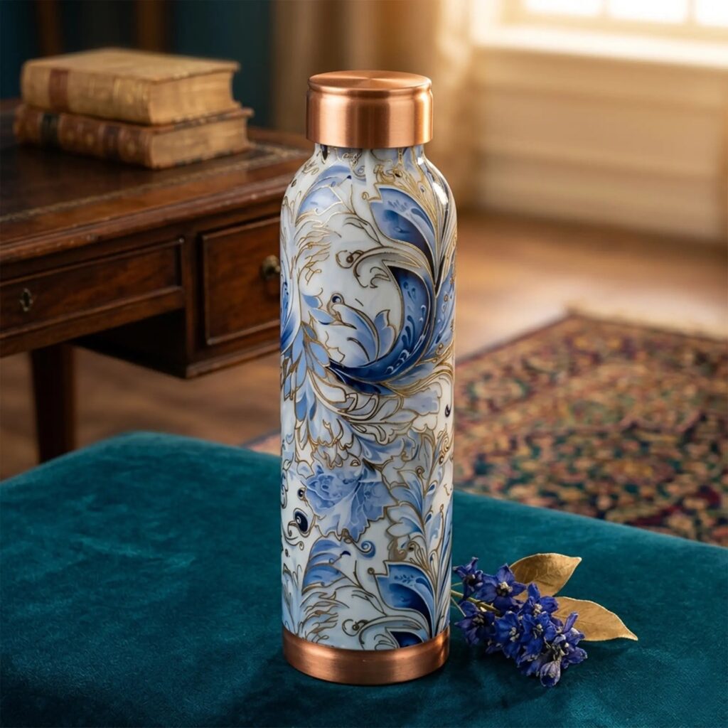
If you spend any time on Instagram or Pinterest, you know the flat-lay. Objects arranged on a surface — usually wood, marble, or linen — and photographed from directly above. A journal. A ceramic mug. A candle. Some greenery. And increasingly, a metal bottle.
The flat-lay became popular because it is honest about what it is doing. It is not pretending to be candid. It is a curated image of a curated life, and the water bottle that earns a spot in that image is the one that looks like it belongs. Plastic does not belong. It reads as accidental. A well-made copper or steel bottle reads as chosen — and that distinction matters enormously in how social content performs.
But the flat-lay was only the beginning. Morning routine videos, travel vlogs, home office setups, gym packing reels — in every one of these formats, what you carry your water in is visible. And visible means it is communicating something whether you intend it to or not.
Why Copper Photographs So Well
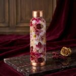
Copper has an unfair advantage in visual media, and the people who create lifestyle content have noticed it. The warm, reddish-gold tone of a copper bottle sits beautifully against natural textures — wooden shelves, terracotta surfaces, cream linen, dried botanicals. It catches light differently at different times of day. Morning light makes it glow. Shade gives it depth.
It is also a material that develops character over time. A copper bottle that has been used for six months looks different to one fresh out of the box, and not in a worse way. That natural patina, the slight shift in tone with use, is something a camera picks up. It tells a story. Social media content built around authenticity and lived experience responds well to objects that visibly age.
What copper does not do is look generic. You cannot mistake a copper bottle for mass-produced convenience. That rarity in a sea of identical plastic containers is, in itself, a visual statement.
Steel and the Active Life
Steel found its visual home in different but equally influential corners of social media. The gym reel. The trail running photo. The morning workout content where everything in frame is functional, considered, and slightly aspirational. A steel bottle next to a pair of training shoes or strapped to the side of a hiking pack reads as capable. It says something about the person carrying it without them having to say anything at all.
The minimalist workspace aesthetic also adopted steel early. Brushed finishes, clean lines, the absence of branding noise — steel fits naturally into a desk setup that is trying to communicate focus and intention. Alongside a mechanical keyboard or a well-chosen notebook, it belongs.
What steel offers that copper does not is versatility across environments. It looks right in rough outdoor conditions and equally right in a clean, quiet office. That range has made it a consistent presence across very different types of lifestyle content.
The Wellness Grammar
Wellness content has its own visual language, and it has been dominant on social media for the better part of a decade. You know it when you see it: soft morning light, natural materials, the suggestion of ritual, the absence of clutter. Green juice. A yoga mat. A meditation cushion. Things that signal you are taking your health seriously and doing it with some care.
Copper fits this grammar almost too well. It references Ayurvedic tradition — copper vessels used for water storage have been part of that practice for centuries. Whether or not the person posting knows that history, the material carries the association. It reads as intentional, health-conscious, connected to something older than the algorithm.
Steel fits differently — it speaks more to physical discipline than spiritual practice. But both materials signal the same underlying thing: this person chose carefully. They did not just grab whatever was at the checkout.
What Makes It Last Beyond a Trend
The worry with any product that gains traction through social media is that it fades just as quickly. A product that is popular because it looks good in a photo has a shelf life tied to what looks good in photos next month.
What copper and steel bottles have going for them is that the visual appeal is not disconnected from the actual appeal. They photograph well because they are made well. The warmth and texture of copper is real, not a finish applied to plastic. The clean precision of steel is structural, not printed on. When people share these products, they are sharing something they actually use and value — not a prop.
That is what separates a product that trends from one that stays. The aesthetic is the honest expression of the object, not a costume it is wearing. Copper and steel bottles became part of a lifestyle because they earned it — through daily use, real performance, and the kind of quiet visual confidence that no amount of marketing budget can manufacture.